When you’re spending your Sunday afternoon browsing through your local book store, you tend pick up a book based on the cover. Unless you’ve read a great review, or had a recommendation from a friend, you are judging the typeface on the binding, the title and the image on the book cover. You have an immediate reaction that makes you pick it up, or walk away, never having even read the jacket flap…
Now that we’ve all admitted that we’re secretly superficial when it comes to picking up an unknown book, lets look at what goes into putting that cover together. Today I have MW with me to show us how many changes a cover can go through before being finalized and to teach us a little bit about why publishers make certain decisions in regards to covers.
For this demonstration, so to speak, we will be looking at the book Gaff by Shan Correa. The book is set in Hawaii, where Paul lives with his disabled father, who makes a living raising, training and caring for roosters. However, Paul has been sheltered from the harsh reality of the ties between the family business and the underworld of cockfighting. He struggles to understand his family’s livelihood and learns that being a man has nothing to do with wielding the power to hurt people and animals.
MW, for starters, are there any basic book cover ‘rules,’ or elements that you try to avoid when designing a cover?
What is your favorite part about designing covers?
Designing YA book covers lets you take the words off the page and literally transform them into something graphic and visual. The best part for me is looking at the text not just as words but as images and then finding the right one to really capture what I think the book is. I must admit that I love seeing a cover to fruition and holding the final product in my hands.
What was your original idea for the cover of Gaff? Why didn’t it work?
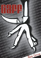
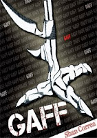
Well, like I said before, words can conjure up all sorts of images. I don’t know about you but the word gaff does not come up in many of my conversations, but has a very intersting and graphic natrue to it. I wanted to show a gaff on the leg of a rooster and really have the gaff be what stood off the page. Unfortunately, like most starting ideas, it was not polished enough, and although it was a good idea it did not read as a blade at first glance. So we decided to really show the rooster and still highlight the gaff but let the reader stop and say… “what is that thing on the roosters leg.
How did you feel about the changes you made to the second and third covers? What did you like? What wasn’t working for you?
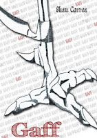
When creating anything, especially book covers, changes are going to happen and first ideas will become third ideas or even sixth ideas. But, with every change or every new idea comes a more polished and a more cohesive cover, so that the end result is something that we are all proud of and something that highlights the story. You can see that while designing Gaff, I threw out many ideas. I liked the idea of grabbing the harshness of cockfighting but making it what a kid would see on the bookstore shelves today. However, in the first two covers the main part of the book was not coming across. Yes, the book deals with cockfighting but it is also a coming of age story, and that part of is was lost.
This next cover is my personal favorite. Why was it not an option? How did it not work for the book? What were the main criticisms of it?
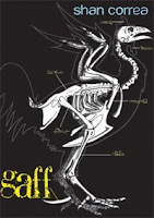 I think my personal favorite will still be the rooster skeleton as well. We wanted to label parts of the rooster and highlight the Gaff as if it was actually a part of the rooster itself. Although it was a good concept it was not right for the age group (8-12). It came off too adult and as one editor said “a little like something you would see on a Chuck Palahniuk novel.”
Four covers in and you had something pretty final. Were you happy with this cover? Why was it ultimately changed again?
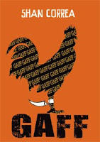
To be honest I was okay with the cover. It was not my favorite but it was something that we all thought was a good fit for the age group and the book itself. It still highlighted the Gaff, but made it feel younger. However, it lacked movement, excitement and the tropical feeling that created the unique setting in the book. This particular story takes place in Hawaii where cockfighting is still part of some cultures. I am glad we came to the decision that that the cover needed to have the movement of a cockfight and a splash of color.
It was important to the author that the cover reflect Hawaii in some way. Was this a difficult element to add in?

It was not as important for the author as it was to our booksellers. The Hawaiian element is one of the things that would really help this book sell. In the end, lets face it, we want a good book but we also want it to sell. The problem was that the main Hawaiian elements we were thinking of were very cliché and feminine. This book takes place inland where there really is no ocean and Hawaiian shirts. So instead we played with color. The blues and oranges give it a feeling of the tropics and palm tress really just seal the deal.
The final cover really makes the rooster pop off of the page and seems to fit with the overall themes of the book. How did you make the final choices as far as typeface, colors, etc. Do you think the changes made from the original concept were positive changes?
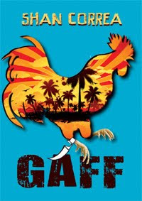
I love where this cover took us. I think that my original ideas were blended nicely with the idea and changes of those around me. The final choice of the colors stems from wanting a tropical feel like I mentioned before. But I wanted something that would pop of the page as well, which is where the bright blues and oranges came from. As for the typeface. I love typography and think it can really add or take away from the character of the book. In this case the final decision to use these fonts was for the sheer fact that they gave that beach feel but were still a little rugged and harsh in places, just as this novel is. With the combination of the blue background and making the rooster stand out with the image within it made this cover have the movement we were looking for. The rooster kind of jumps out at you like roosters are meant to do at a cock fight, but still keeps the elements it needs to be right for boys of this age group. And with a little help of production magic we have a foil on the rooster’s gaff. This final, simple touch, is what really made the idea come full circle. I wanted the reader to see a rooster and say what is that thing? And now they just might.
What else goes into designing a book cover that most people don’t realize?
Thanks so much to MW for taking the time to give a little insight into designing a YA book cover. Be sure to leave and comments or questions for MW below! She’s be happy an answer anything you think has been left out.


Leave A Comment
You must be logged in to post a comment.